Block 67 RFP
Multi-Party proposal response • editorial design • Visual Identity

Block 67 is a response to the City of Hillsboro’s request-for-proposals (RFP) for a development partner to revitalize an underused downtown block. Working simultaneously with clients Rembold, Ankrom Moisan, and Related Northwest, our goal was to address housing needs at all levels while revitalizing the neglected block. We created the custom brand “Viridian” to drive a community-focused design aligned with the City’s vision. Viridian honed in on the concepts of connectivity, vibrancy, health, sustainability, and community. By incorporating the brand throughout the proposal, it ensured a cohesive and clear message that emphasized its community-centric approach. Effective collaboration was essential in managing multiple clients, project schedules, and timely delivery. Utilizing the Miro platform, our team achieved real-time communication and efficient brainstorming, resulting in a well-rounded proposal. This proposal highlights my clients’ ability to meet the City’s vision through effective collaboration, brand integration, and a community-focused design.

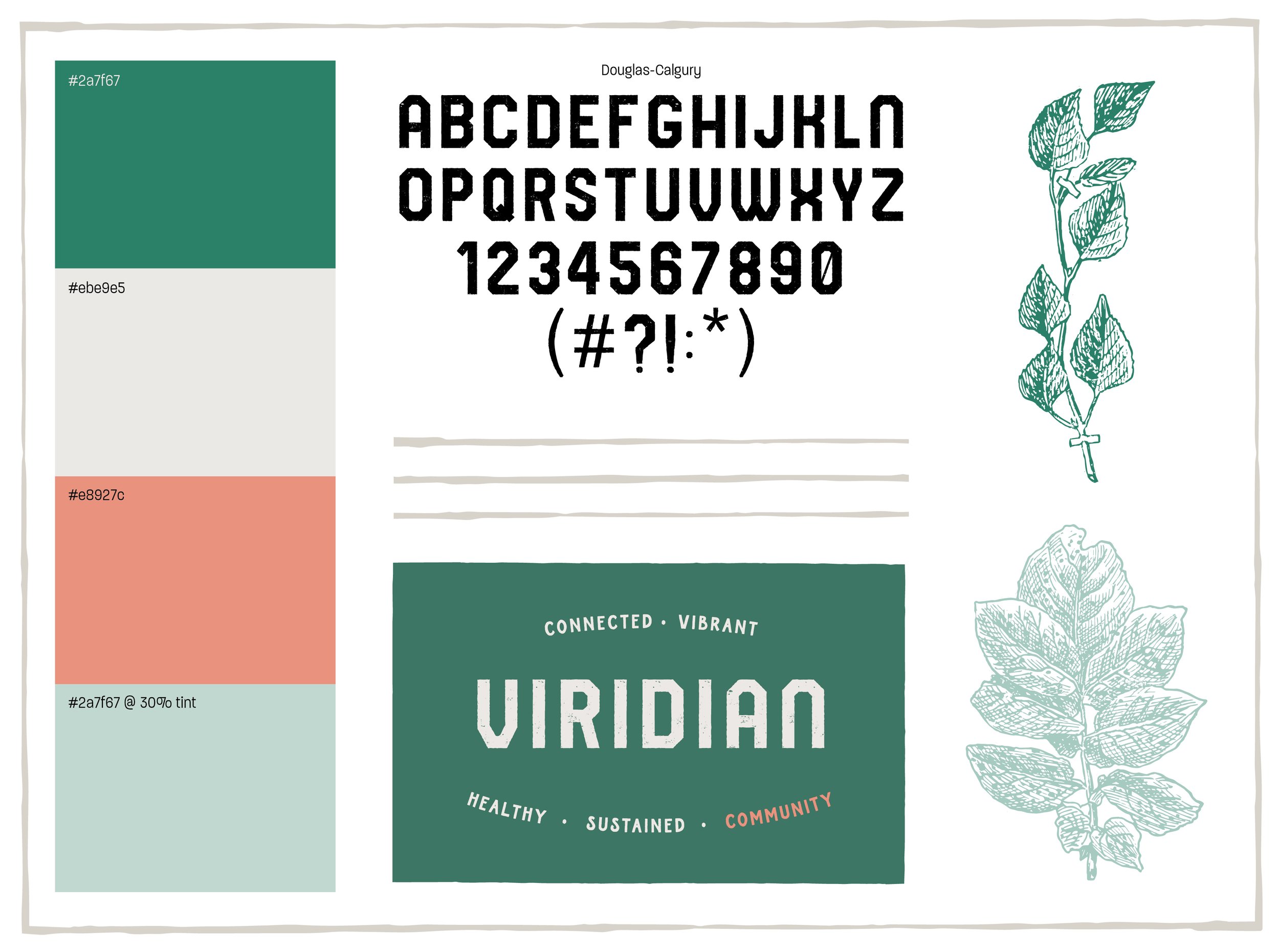
During the creation of this proposal response, we created a mini-brand that served two purposes: first, to align the project goals with the city’s proposal, and second, to define the vision of our proposing group. Our objective was to find a name and visual assets that not only captured the essence of the project but also conveyed a clear vision. After careful consideration, we selected the name “Viridian” because it encompassed the project’s spirit and reflected its core values. The name not only carries the significance of the strong blue-green color but also represents nature, health, and good luck. To visually complement this concept, I incorporated a lush teal shade alongside tan and salmon colors. To enhance the brand’s connection with nature, I utilized botanical line drawings and textured lines. Additionally, I opted for the Douglas Calgury typeface, which exudes a gritty aesthetic. By combining these elements, we successfully developed a nature-centric mini-brand that aligns with our vision.